A tiny house on wheels reads as a single continuous room before it reads as a plan. That is the first thing the eye registers, and it explains why two layouts with nearly identical footprints can feel entirely different. In one, the sightline from door to rear window runs clean and the interior feels composed, almost generous. In another, a partition or a tall cabinet interrupts that line and the same volume turns tight and restless. The architecture here is less about square footage than about sequence: what you see first, what is held back, and how the light arrives. Free tiny house plans on wheels are useful precisely because they let you study that sequence on paper, but the drawings also reward a visual reading rather than a purely technical one.
Proportion does most of the emotional work. A tiny house is long and narrow, and the eye naturally travels lengthwise. Plans that protect that axis, keeping the center of the room relatively clear and placing bulkier elements at the edges, tend to feel calm. When the eye is stopped repeatedly by furniture-scale masses, the room feels crowded even if nothing is technically in the way. Height matters just as much. A pitched or vaulted ceiling draws the gaze upward and relieves the narrowness below; a flat ceiling at a modest height can feel correct if the wall colors are light and the floor is quiet, but it leaves little room for error. The proportions that feel balanced are usually the ones where the vertical and horizontal dimensions acknowledge each other rather than compete.

How light and sightlines shape the room
Light is the second structural element, and in a small volume it is almost a material. Windows placed at both ends of the long axis pull the eye through the space and make it feel deeper than it is. A window on only one side flattens the room and leaves the far end in shadow. In a plan with a loft, the stair or ladder becomes a vertical sightline, and its placement determines whether the upper level feels connected or hidden. Glazing near a seating area changes how the room is used at different times of day, and in colder climates that same glass can become a source of draught and condensation unless it is specified with care. The visual generosity of large windows and the thermal reality of a small envelope are in constant negotiation, and a plan that ignores this tends to feel either dark or uncomfortable depending on the season.
Materials and texture carry the atmosphere. In a compact interior, every surface is close enough to be read in detail, so a single strong texture, such as a timber ceiling or a limewashed wall, can hold the room together while several competing textures make it busy. Color behaves similarly. A restrained palette with one deeper accent reads as intentional; scattered strong colors fragment the space because the eye has nowhere to rest. The plans that feel forced often try to compensate for smallness with visual noise, and the result is the opposite of what was intended. Quiet surfaces let the proportions and the light do the work.
Where the tiny house sits matters as much as what is inside it. A plan with a large opening toward a view extends the room beyond its walls, and the interior can afford to be simpler. A house parked against a fence or in a dense setting has to create its own sense of depth, which usually means more careful attention to interior sightlines and reflected light. Climate shapes the same decisions. In a hot climate, deep overhangs and shaded glazing keep the interior from overheating; in a cold one, a compact entry and a well-insulated envelope matter more than a dramatic window wall. The same drawing can be right in one setting and wrong in another.

Reading the plan before committing to it
Free tiny house plans on wheels are often shared as drawings without much guidance on how they will feel in use, so it helps to read them the way you would read a photograph. Trace the path from the door to the farthest point. Notice where the eye is stopped. Check whether the kitchen, the sleeping area, and the seating share one volume or are separated, and ask whether that separation suits your daily routines. A household that cooks and entertains will feel cramped by a plan that treats the kitchen as a corridor, while a household that mostly sleeps and reads may find an open plan wasteful of wall space. The plans that feel disconnected usually ignore routine: they look elegant on paper but place the things you use most in the places you pass least.
Maintenance and budget belong in the same reading. Timber cladding, painted surfaces, and natural stone each age in their own way, and in a small house a single worn surface is more visible than it would be in a larger one. A plan that depends on expensive finishes to feel resolved is a fragile plan; the strongest ones hold together with modest materials because the proportions and light are doing the work. Budget also determines how much of the drawing survives construction, and a simplified version of a good plan usually feels better than a compromised version of a complex one.
There is a real limitation worth stating plainly. A tiny house on wheels is a constrained envelope, and no plan can make it suitable for every household, every climate, or every site. Storage is finite, privacy is limited, and the building’s mobility brings its own structural and servicing questions. Before building, have the structure, electrical work, plumbing, waterproofing, and fire safety reviewed by qualified local professionals, and confirm what permits and siting rules apply where the house will actually stand. Those checks are not obstacles to the design; they are part of reading it honestly.
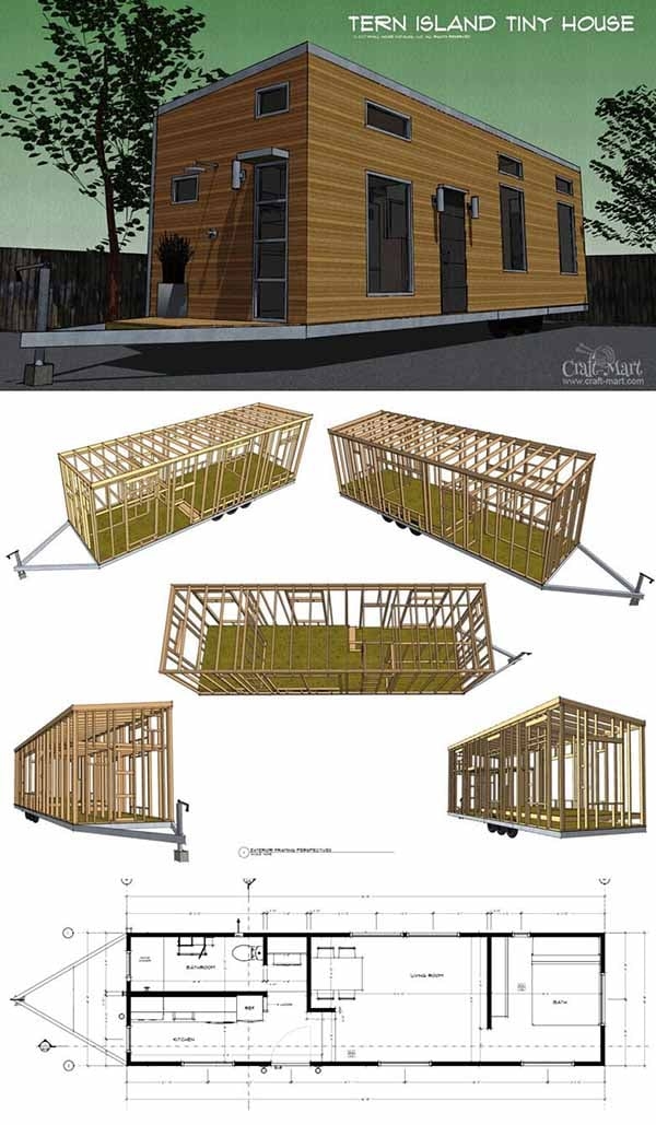
The most convincing tiny interiors tend to be the least insistent ones. They let the long view stay open, place light where it can travel, keep materials few and honest, and accept that the room is small rather than trying to disguise it. Free plans are a starting point for that judgment, not a substitute for it. The eye knows when a space feels settled, and it usually knows why: the proportions agree, the light has somewhere to go, and nothing is fighting for attention.


